Thursday, 16 December 2010
In what ways does your media product use, develop or challenge forms and conventions of real media products?
Our music video is of a love/hate relationship influenced by various iconic characters and scenes in the same genre. As well as both using and developing many forms and conventions, we have also created original ideas that have some link to iconic film scenes. During our research, we tried to find powerful scenes and characters that would make our video more interesting in terms of intertextuality. We believed that by including many features/ideas from well-known films and music videos, not only would our video be better but it will also be more interesting, making reference to other media. Thus we were mostly influenced by a scene in Titanic, Michael Jackson, and also The Matrix.
Firstly there was constant reference to Titanic. This influenced us because it was of the same generic type of our music video therefore we used this as we saw it as being relevant and appropriate. From this, we included a necklace throughout our video that was similar to the one the main actress has in the film. We also reproduced the scene where she throws the necklace into the river. As we had an all male group, the main character in our video had to do this. However we didn’t just use this convention, we also developed it as our character did this whilst on a bridge. We did this because there is reference to a bridge in the song lyrics. Therefore we not only used this convention but also developed it.
We were also influenced by Michael Jackson and made constant reference to him during our music video. This was done through various things. Firstly it was demonstrated through the use of costume. Our character had all black clothing, including a black hat and a single black glove. We thought that by making our character similar to the identity of Michael Jackson, this would appeal even more to out target audience as he is not only seen as popular to them, but also as an iconic figure of music. Also, throughout our video, we never see the characters face clearly until the end of the video. By creating this anonymity, there was a sense of mystery upon both the character and audience. This mystery then affects the audience in that it makes them become more interested. As well as the clothing being in reference to Michael Jackson, we included the “Smooth Criminal Lean.” We used green screening to do this, as we created a smoky background. We found this scene to be very successful and this was reinforced by the audience feedback.
As our video is of a love/hate relationship genre, our demographic audience is teenagers. Through using various conventions of the same genre, we thought this would appeal to our audience. However, we wanted to create it to be more entertaining, thus covering all aspects and areas of which our audience would find interesting. For this we included more action type features. Our prime influence for this was The Matrix. From this, we included stunts and effects similar to that of The Matrix, however, excluding the fighting as we thought this would be irrelevant. Furthermore, examples we included were various jump shots, the necklace magically being pulled into our main characters hand and his hat ascending from the floor into his hand. To do these effects, we filmed him actually doing the opposite, however, when editing this, we reversed it, therefore making it look like he actually did have powers. Another successful effect we did, was making the character slide across the bench. Not only did this look great but it also reinforced the idea of him having powers. This example is a convention of which we developed in our music video.
Saturday, 11 December 2010


Friday, 10 December 2010
How effective is the combination of your main product and ancillary texts?
With our video primarily having a grey theme, we carried this into our CD cover and magazine advert by having the same colours running throughout. We also carried our distinctive imagery and dress code into our print based campaign, with the hat and glove being distinctively used. With the front of the CD cover being the biggest selling point of the CD, it is very important that people can instantly recognise who's single it is. With our front cover, we wanted it to stand out from the rest on the market, as they all consist of an artists face covering most of the panel, so we decided to put a picture of the hat and gloves only, which was worn by the artist in the video. We knew people would instantly associate it with our video, due to it being a predominant part of our video, and the powerful imagery it has. This was also carried on into our magazine advert, which also carried on the same theme of the dress code, the colours used and the font present in the CD and magazine advert. In the magazine advert, half of it is covered with a picture of our artist, with his hand on his hat, again making full use of the hat and glove. We also carried on our font style throughout the print based campaign, by having white and orange used to separate words, like Justin Timberlake and CD/Download. With this being used on all our print based products, people will know it is our product even from a long distance, just by seeing the colours used. For our back cover of the CD, we had the artist in the middle, with light shining down on him from a lamp post, connoting that he is the star and centre of attention. Again, the font used for the tracklist is in white and orange, carrying on the same theme and colours used. Our inside panels also carry on these themes, with the grey background present. On our left panel, we have tree branches in the background with the songs lyrics over it, meaning people can watch the video or listen to the song, whilst singing along to the song. For our right panel, which holds the CD, we simply used the same background, and had an image of our artist and a female holding a necklace. The necklace present is the same one from the video, and it carries on our narrative of the artist looking for the necklace in the video, as it was his girlfriends'.
How did you use media technologies in the construction, research, planning and evaluation stages?

With the availability of Google's extensive range of programs, we were able to research which locations we would use with StreetView and Google maps. With this, we were able to look for suitable locations to use, and with the ability to take a 360 degree view, we were even able to plan possible shots before we got to the location, which was very helpful, as it saved us a lot of time. We also found the song lyrics for "Cry Me A River", which made it easier for our performer to learn the lyrics, instead of repeatedly listening to the song and try to learn them, again saving us time.

Youtube played a huge role in our research, due to its ease of use and the content available. When we were planning about which song to use for our video, we had Michael Jackson in mind, and we decided that he was going to be a part of the video in some form. This instantly lead us to type in his name into Youtube, and after watching a few videos, we found a link to a Justin Timberlake video, and after our first view of Cry Me A River, we all decided to use that song for our music video. Also, we got effects for some of the backgrounds on our green screen which we used in our video. For example, the smoke and the rain effects that we used were essential to our final product, due to the unpredictable weather. We also had to use footage of glass smashing, which we first tried to reproduce by ourselves, but with our camera not being able to shot in slow motion, and the picture quality not being of the highest standard, we decided to use the clip from Youtube instead.
Wednesday, 8 December 2010
What have you learned from your audience feedback?
"The mise-en-scene was really good"
"The Michael Jackson lean is epic"
"The camerawork was brilliant"
"I thought the different close up of their performer worked well"
"How did he fly off the ground?"
These were just some of the feedback we got from our audience, which we hoped we would get after working so hard on this project. During our planning stages, we knew that every group making a music video from our college would have the same equipment to use, so we had to be very creative with what we were able to achieve with the technology available. This lead us to think outside the box, and do something that hadn't been seen before, to make our music video stand out from the rest. After completing the video, we showed it to students and teachers, who were all amazed at the special effects we created, as they kept asking us how we did certain scenes, which was the kind of reaction we were all hoping for.
Our audience also commented on the amount of the reversing in the video. "I felt as though the reversing jump idea was used to many times". So we decided to take some of the insignificant shots out, like when our performer jumped over railings. Another member of the audience said there were a lack of locations, "The locations were a bit limited." This was mainly down to the time allocated to us for the filming and editing. As we knew that editing, the print based campaign and the blog were worth more than the music video itself, we didn't want to spend too much time on the filming of our video, which limited the locations we were able to shoot on. Even though we can't change these factors of our video, if we were to do it again, we would definitely make these changes, because music videos are primarily designed to sell an artists music, and if they are not happy with the final product, it would be in our best interest to suit their wants.
"The character stood still for the lip-sync throughout the video, he should move a bit more." During our planning and filming of our video, we had to two reasons for purposely setting out to have our artist stand still in front of the camera and sing. Firstly, we wanted to distance ourselves from typical videos done by Michael Jackson and Justin Timberlake, which involved a lot of movement and dancing. We did this so that, even though our video made slight references to both artists, we wanted our video to be unique, so the audience wouldn't be able to compare it to anyone else's. Secondly, with the dress code and theme of the video, having our performer moving around too much would contradict with our intentions of having a mysterious character, which we were able to create by having the hat covering the performer's face, and only his mouth showing. During post production, we tried to get some of our narrative in between the lip-syncing, with advice from a member of the audience, but due to the lack of shots we had from the narrative, the whole first verse of the song persists of the artist singing whilst standing still, which wasn't particularly aesthetically pleasing to the viewer, and didn't come out as we had planned, but something we would address if undertaken again.
"There could be something on the green glasses". In the post-production, putting effects on the green glasses did not go as we planned, as the effect would not go on it properly. Even though we found a way to put it on, we weren't able to use it on all the shots, which lead us to experiment with it, and come up with shots that were still aesthetically pleasing, and some members of the audience said it resembled the "Terminator." The shots that didn't come out as planned were mostly the one's of when we didn't use the green glasses with the green screen. This happened because the software didn't recognise the green, due to the lighting, which we would strongly take into account if we did the project again.
"Narrative was complicated, it was hard to understand". Our video did have a complicated narrative, which isn't common in music videos, making it very difficult for our audience to follow it. In our video, the artist receives a letter, which contained a picture of two people kissing. The female in the picture was the artists girlfriend, which lead the artist to drop her necklace into the river, as she cheated on him. The audience didn't mainly get the storyline because of its complication, and the fact that we didn't tell it properly. If we did the video again, we would definitely simplify the narrative, and include more of the story in the video, perhaps replacing it with the shots of our artist standing still whilst lip-syncing, as some did say that even though our special effects excited them, the lip-syncing scenes were sometimes boring to watch.
Tuesday, 7 December 2010
Magazine Advert Analysis (2)


Both of these images are advertising concerts for the artists, which are common in magazines nowadays. Firstly, the artists are the main focus of attention, as they take up half of the image, immediately making people aware who's concert it is. Also, the names of the artists are big and bold, which stands out from the rest of the text, so people will instantly know who it is again. Another feature present are the dates, times and venues where the singers will be performing in, which, which is important for the consumer, so they have time to plan for the event. And finally, the small prints and relevant logo's are also shown, containing any copyright laws, any contact information, and even possibly, social network sites, which are very common in advertising nowadays, due to their huge popularity.
Sunday, 5 December 2010
Magazine Advert Analysis

The person in this magazine advert is Ne-Yo, and he is promoting a song called "Mad". The person in the picture is big and right across the page, showing the person is important. This is also supported by the camera work as it was taken in a low angle shot. The person is diagonally across the picture, making him stand out. Also, shallow depth of field was used, making the background blurry, therefore making him stand out more. The person is wearing a suit and a hat, as he walks in front of a classic vehicle, indicating that he is rich. The target audience of this magazine advert is mainly teenage girls.

The person in this magazine advert is Justin Timberlake, promoting his song "My Love". There is a red circle in front of his face, with only limited parts of the face showing, creating mystery and showing the star quality he possess, because only parts of him have to be shown for people to recognise him. Also, the person is at the centre of the picture, making him stand out and connoting that he is important. The font is formal, which matches well with the dress code.
Thursday, 2 December 2010
CD Cover Analysis (Back)


One thing that all these back covers have in common, is the fact that they all have bar codes and the logo of the record labels present. They also have copyright laws in small print at the bottom, and any relevant websites, be it the official site of the artist, the label, or the artists Facebook or Twitter accounts, due to the rapid growth of both social networking sites. Also, the artist is usually present, and there is a seamless transition between theme of the front cover and the back. These are important things we need to consider for our own CD cover, to make it look professional.
Wednesday, 1 December 2010
CD Cover Analysis (Front)
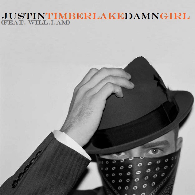

The name of the artist on the CD covers is Justin Timberlake. The cover on the top shows a person's head at the bottom of the picture, which immediately draws people's attention to it, and with the whole face covered and only the eyes showing, it creates a sense of mystery, as his facial expressions are not shown. The colour of the picture is black and white, which creates a sense of old style, and with a hat used in these pictures, it would be similar to our concept. The font used at the top picture is "Times New Roman" this looks formal, which relates to the theme of the CD cover, as he is wearing a suit. In both of the pictures, Justin Timberlake has his hand on his hat, which would be percieve as cool. The person at the bottom picture is at the centre, which also makes him stand out in the picture. With the pose he is doing and the clothes he is wearing, he looks like an important man.


The name of the artist on these CD covers is Michael Jackson. The cover at the top is called "Blood On The Dance Floor", which looks like it had been written in blood, creating a sense of creepiness and mystery. The person is at the bottom left of the picture and there is a shadow of him on the wall striking his pose, making him a predominant figure. The picture at the bottom shows the person's face covered by the hat, again creating mystery. The "King Of Pop" is in yellow and "Michael Jackson" is in white, making both of the writting stand out. The background of the cover is red, which makes the whole cover more eye catching.
Overall, having analysed the CD covers, we have learned that the main character is at the centre of attention, and the writing needs to be eye catching, big and clear to read.
Subscribe to:
Posts (Atom)